Custom Home Builder Website Design: 15 Examples Worth Learning From
A custom home is the most considered purchase most people will ever make, and they decide whether to trust you with it can largely be affected by your website. Here are fifteen custom home builder websites that earn that trust, and the one move to learn from each.
A custom home buyer evaluates you for months, mostly through your website, and decides whether you are worth a conversation before you ever hear from them.
The best custom home builder websites are not the flashiest. They are the clearest at proving the work matches the buyer's taste, proving the team is trustworthy, and making the next step obvious.
Across these fifteen, the same high-value moves repeat: hard proof presented up front, a visible process, real work shown at scale, and one low-friction way to start a conversation.
Most of what separates a great builder site from a forgettable one is messaging and presentation, not budget. The moves below are about what you show and say.
Pick the two or three moves your current site is missing and start there. You do not need a rebuild to close most of the gap.
A buyer planning a two or three million dollar home does not choose a builder the way they choose a restaurant. They research for months. They study galleries, read reviews, compare companies on every visible detail, and rule people out long before anyone picks up a phone. By the time they reach out, they have already decided you are worth the conversation, or they have already decided against you and you will never know it happened.
Your website is where most of that deciding happens. It is the one thing about your firm a high-net-worth buyer can examine at eleven at night, on their own time, with no salesperson in the room. Good custom home builder website design is not about winning a design award. It is about answering, quickly and convincingly, the three questions every serious buyer is asking: does this firm's work match what I want, can I trust them with something this big, and will this feel organized instead of chaotic.
We build brands and websites for builders and remodelers, so I spend a lot of time looking at how teams in this space present themselves. Below are fifteen custom home builder websites that get something genuinely right. I am not pointing at them so you can copy the look, because the right look depends on your market and your brand. I am pointing at them so you can learn the move. Each one does at least one thing that turns a browsing buyer into a booked consultation. Here is what to notice.
What works: Jenkins puts its credibility in numbers a buyer can absorb in three seconds. A band titled "The Architect-Led Difference, By the Numbers" states thirty years building in Austin and the Hill Country, more than 130 international, national, and state awards, and four-time Custom Builder of the Year. Then, immediately below it, "Client Stories," real named homeowners with their towns. The sequence is the whole lesson. Hard, quantified proof answers can I trust them, and the named client testimonials right underneath answer will I be treated well, back to back, before the buyer has to go looking for either.
The move to learn: pair quantitative proof with human proof, and put both high on the page. Awards tell a buyer you are capable. Named clients tell them you are pleasant to work with. Most teams bury one or both. Stacking them is what turns credibility into comfort.
What works: Montana Build says less, and it reads as more expensive for it. Bold white type against a black background, striking imagery, a homepage stripped to a view-portfolio invitation, a short brand statement, and a handful of arresting photos. Nothing competes for attention, which lets the work carry the impression entirely. For a team at this tier, looking calm and selective is itself an asset, because a builder who has to shout is a builder who may not be busy.
The move to learn: when your work is strong, get out of its way. Fewer word and larger images can read as more premium than a homepage crammed with everything you offer. Restraint is a luxury cue that costs nothing.
What works: Cullum leans on production quality as the argument. Cinematic drone footage, grand landscapes, polished interiors, all shot and edited to a standard that matches the homes themselves. The site is a textbook case of what real photography and video budget buys you, which is that a buyer feels the caliber of the work before they read a single claim about it. The experience of the website itself becomes proof of the experience of the build.
The move to learn: at this price point, the quality of your imagery is not a nice-to-have, it is the message. A buyer evaluating a multimillion-dollar build reads phone snapshots or dated photos as a mismatch with the promise. Investing in professional photography and video is investing in the single thing that carries the most weight on the page.
What works: Where most builder sites open on a glossy hero of a finished home, Arrowwood uses blueprints and what look like hand-drawn floor plans. It is a small choice with a big effect. It signals craft and authenticity, it speaks directly to what the firm actually does, and it differentiates the brand instantly from a market full of those identical drone shots. The visuals do tell a story.
The move to learn: a distinctive visual choice can set you apart faster than any tagline. You do not have to look like every other builder in your market. A consistent, ownable visual language, used deliberately, makes a buyer remember you when they are comparing three other teams.
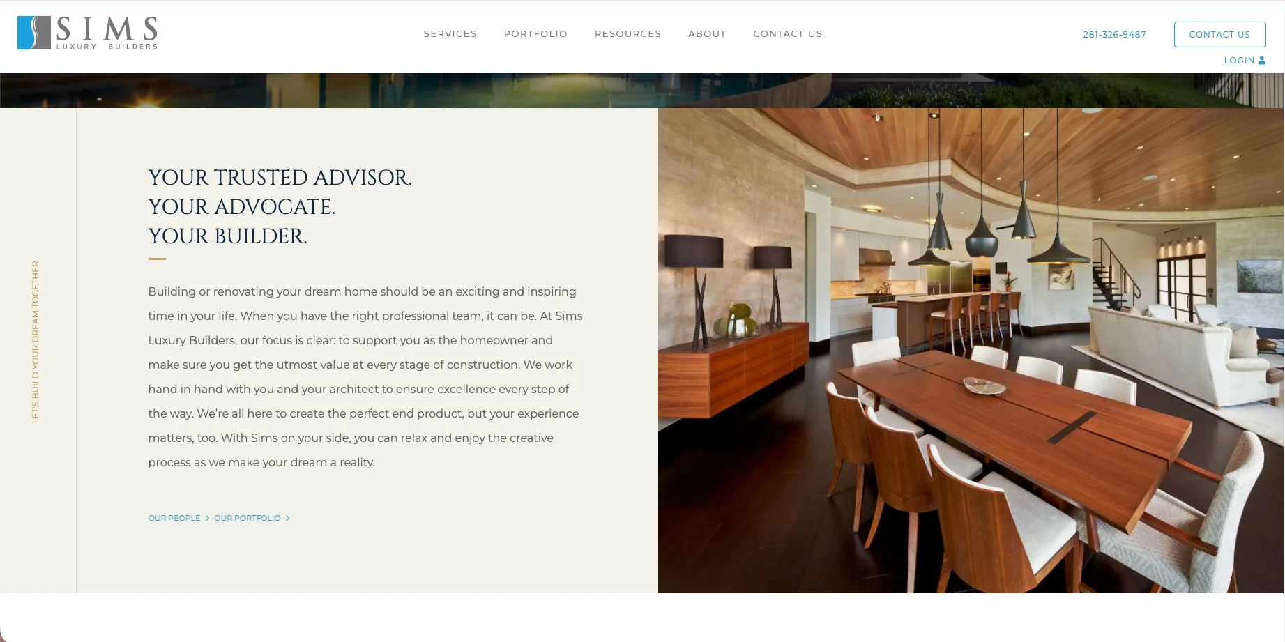
What works: Sims balances striking imagery with language that reframes the relationship. The site positions the firm as the buyer's advocate, not just a vendor of construction, weaving trust-building phrases through the experience alongside real proof of range and experience. For a buyer who is nervous about handing their life savings and two years to a stranger, being told, in effect, that this team is on their side does real emotional work that photos alone cannot.
The move to learn: your positioning language matters as much as your portfolio. A buyer choosing a builder is choosing who to trust through a stressful, expensive process. Copy that frames you as their advocate and guide, rather than just the company that swings the hammers, speaks to the fear underneath the purchase.
Seeing the Gap in Your Own Site Yet?
If you have been reading this with your own website open in another tab, quietly noting everything it does not do, that is the useful part. The hard version is fixing it, because you are too close to your own site to see what a buyer sees. That is the work we do for custom home builders: we look at your site the way a high-net-worth buyer does, on a phone, comparing you against two other firms, and we tell you exactly where the proof is thin, the process is unclear, or the next step is buried. No pitch attached. If your site is already doing its job, we will tell you that too.
What works: Schumacher leads its homepage story with a founder video, "The Schumacher Homes Story," framed around family and legacy, "It all started with a single house." The founder story humanizes a large operation and makes it feel like people rather than a logo.
The move to learn: a founder or team story builds trust that stock corporate copy cannot Humanize the brand, then make it effortless for the buyer to see they belong.
What works: Cornerstone pairs an emotional tagline, "We bring you home," with a prominent "as seen in" press band near the bottom of the page. It is a smart one-two. The tagline sets the feeling, the aspiration a buyer is actually chasing, and the press logos immediately back that feeling with third-party credibility so it does not read as empty sentiment. Emotion and proof, on the same screen.
The move to learn: lead with the feeling, then immediately validate it. A homepage that is all emotion feels like marketing. One that is all credentials feels cold. Pairing an aspirational message with recognizable proof in the same view gives a buyer both the reason to want you and the permission to believe you
What works: Hill devotes an entire, comprehensive "Press + Awards" page to a wall of real magazine covers, Architectural Digest, Galerie, Luxe, Interior Design, Wallpaper, Dwell, Elle Decoration, California Homes, and more, each a genuine editorial feature. For a firm that has earned that recognition, it is one of the most persuasive pages a builder can have. It does not claim to be elite. It shows, cover by cover, that the most respected design publications already said so.
The move to learn: if you have earned press and awards, give them a real home, not a cramped logo strip. A dedicated, visual wall of recognition is a powerful authority display for a high-net-worth buyer, because third-party validation from names they respect carries far more weight than anything you say about yourself. This only works if the accolades are real, which is exactly why it is so convincing when they are.
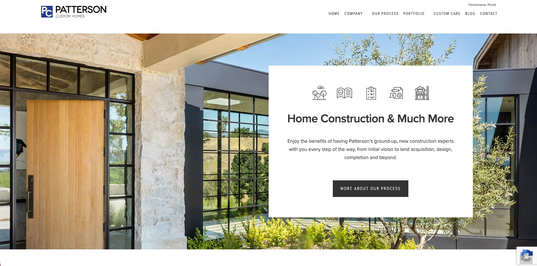
What works: Patterson does two things well beyond the expected drone footage. It teaches the process directly on the homepage, giving a buyer a high-level understanding of how a build unfolds. Though this process is on a secondary page, the call out on the homepage gets interested buyers quick answers before reaching out. Someone thinking about trusting a team for two years is reassured to see that company still shows up consistently.
The move to learn: show how the relationship continues. A visible process reduces the fear of the unknown, and (bonus) a stated after-care or warranty program reduces the deeper fear of being abandoned once the check clears. Both make a huge, scary commitment feel safer.
What works: Sina keeps a deliberately simple four-item navigation, and one of those items is "upcoming projects" alongside "past projects." That is rare and worth noticing. A lot of builders show only finished, polished work. Showing what is currently underway signals an active, in-demand pipeline and lets a buyer see the team is genuinely building right now, not just displaying a highlight reel from years past. It is proof of momentum.
The move to learn: show work in motion, not only the finished result. A section for current or upcoming projects tells a buyer you are busy and building, which is reassuring in a market where they cannot always tell who is thriving and who is coasting on old photos. Momentum is its own trust asset.
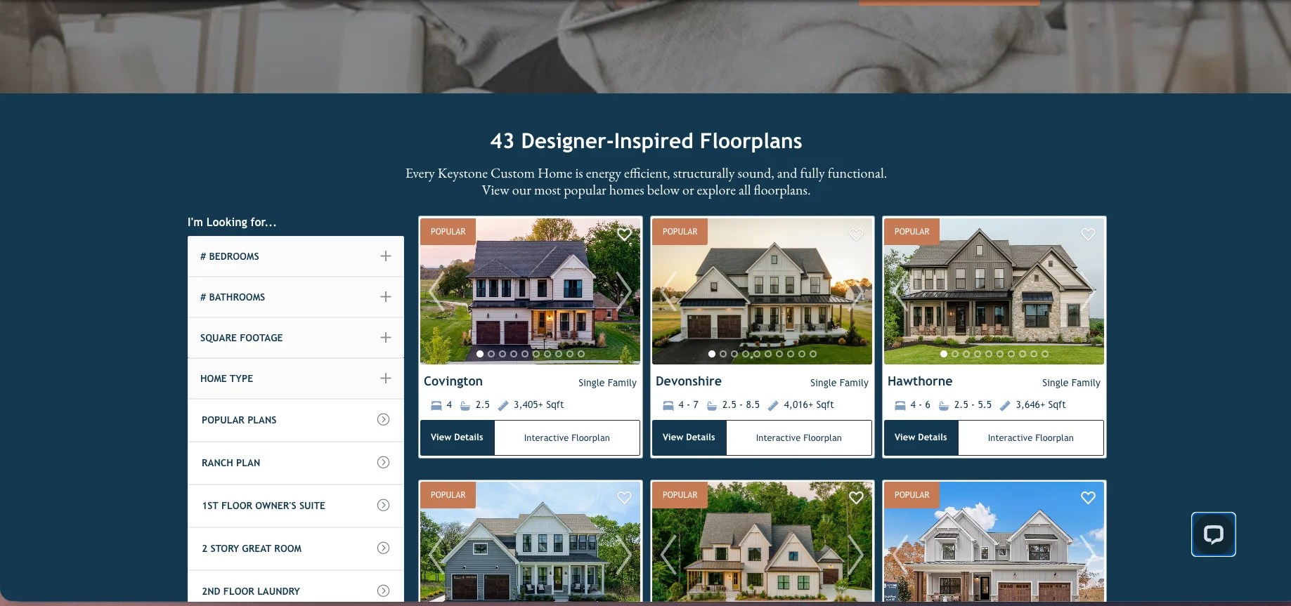
What works: Shawood features its communities directly on the homepage, giving a buyer an immediate, organized way to see where the firm builds and to picture themselves in a specific place. Rather than making a visitor dig to understand geography and offerings, the featured-communities section turns a vague "they build custom homes somewhere" into a concrete "they build in a place I can see myself." It is orientation and aspiration at once.
The move to learn: help a buyer locate themselves fast. A featured-communities or featured-locations section on the homepage answers where and lets the buyer self-select into the place that fits them, which is far more engaging than a generic map or a buried service-area list. The specificity of place makes the dream concrete.
What works: Group Three maintains a dedicated available-homes page showing active homes it is building or selling. This asset gives a browsing buyer a reason to keep coming back, because inventory changes, and it converts a passive gallery visit into an active "what is available right now" search. It keeps interested buyers engaged month to month while they are still deciding.
The move to learn: give buyers a reason to return. A finished portfolio is static, but an available-homes or current-offerings page is dynamic, and dynamic content pulls a considering buyer back to your site repeatedly during a long decision. Every return visit is another chance to move them closer.
What works: KRM segments its offering by build type, custom builds, modular homes, the Tanzanite series, and rural builds, and routes each to its own page where a contact form is the first thing a buyer sees. This is smart on two levels. It lets a buyer immediately find the exact category that matches their situation instead of wading through a one-size-fits-all pitch, and it puts the capture point right where their intent is highest, at the moment they have self-identified as the right kind of buyer.
The move to learn: segment by what you offer, and put the next step where the intent lands. When a buyer clicks into the specific type of home they want, they are telling you they are interested. Meeting that moment with a clear, immediate way to start a conversation converts far better than a single generic contact page far from the thing that hooked them.
What works: Drexel gets to the point in the hero, then offers a downloadable "guide to designing a new home" and clearly states its brand differentiators, something surprisingly few builders bother to do. The download captures a buyer who is early in research and not ready to talk yet, and the stated differentiators answer the question every buyer is asking and most sites leave them to guess at.
The move to learn: give the early-stage buyer something useful to take, and tell them plainly what makes you different. A downloadable guide captures a months-away buyer before a competitor does, and explicitly naming your differentiators removes the burden of the buyer having to figure out your value on their own. Do not make them guess why you are the right choice.
What works: RW Anderson runs a monthly newsletter as a deliberate retention tool, a way to stay in front of interested buyers month after month across a decision that can take a year or more. For a purchase with this long a cycle, that is exactly right. A buyer who visits once and hears nothing again is a buyer who forgets you. A newsletter keeps the firm present through the entire slow deliberation, so that when the buyer is finally ready, the name they remember is the one that kept showing up.
The move to learn: capture and nurture the long-cycle buyer. Custom home decisions stretch across months or years, and the firm that stays gently present the whole time wins the recall. An email capture paired with a genuinely useful monthly touch turns a single visit into an ongoing relationship that outlasts the competition's one-and-done impression.
What to Take From All Fifteen
Look across these fifteen and the same truths surface again and again. The sites that work are not the ones with the most effects or the biggest hero videos. They are the ones that prove the work matches the buyer's taste, prove the firm can be trusted with an enormous decision, and make the next step obvious. They lead with real proof, they show the process and the momentum, they speak to the fear underneath the purchase, and they give the buyer a clear, low-friction way to begin.
Almost none of that is about budget. A proof bar, a stated differentiator, a founder's story, an available-homes page, a monthly newsletter, these are messaging and presentation choices, not always expensive rebuilds. Pick the two or three moves above that your current site is missing, and start there.
If you want the broader picture of how your website fits into everything else that brings a buyer to your door, our complete guide to marketing for custom home builders lays out the full system the site sits inside. You can see how we think about custom home builder specific marketing specifically on our custom home builders page. And when you would rather have a team build a site that does all of this for your firm, that is exactly what our website and creative work is for.
Frequently Asked Questions
What makes a good custom home builder website? Clarity and proof more than visual flash. A strong custom home builder website quickly proves the work matches the buyer's taste with real project photography, proves the firm is trustworthy through awards, press, named client stories, and a visible process, and makes the next step obvious with one low-friction call to action. Because the buyer is making a months-long, high-stakes decision, the site's job is to reduce perceived risk at every scroll.
How is a custom home builder website different from a remodeler's? The decision is longer, larger, and more considered, so the site has to do more nurturing and more risk reduction. Custom buyers research for months or years, often before they have land or financing, which means the best builder sites capture early-stage buyers with guides and newsletters, show current and upcoming work to signal momentum, and lean heavily on authority proof like press and awards, because the sums involved make trust the deciding factor.
Do I need professional photography and video? For this buyer, I would say absolutely yes. A visitor evaluating a multimillion-dollar build reads phone snapshots or dated images as a mismatch with the promise, and it quietly costs you credibility. The imagery is not decoration on a builder site; it is the primary evidence of your caliber, which is why the strongest examples invest in professional photography and, where it fits, video walkthroughs and drone footage.
Should a custom home builder website show pricing? It should give a buyer a way to understand cost, even if not a fixed number, because a buyer who cannot get any sense of investment from you forms their expectation elsewhere. Downloadable design or budgeting guides, cost explainers, and clear positioning about the level you build at all help a buyer self-qualify before they call, which means the conversations you do have are with better-fit clients.
What is the most important element on the page? The proof that reduces risk, presented high and clearly. For a high-net-worth buyer making a huge, scary commitment, the single most valuable thing a site can do is prove quickly that the firm is capable and trustworthy, through awards, press, named testimonials, a visible process, and evidence the firm is actively building. Everything else supports that.
Do I need a full rebuild to improve my site? Usually not. Most of the highest-impact moves in these examples, a proof bar, stated differentiators, a founder story, an available-homes section, an email capture and newsletter, are additions and presentation changes rather than ground-up rebuilds. Start with the two or three your current site is most obviously missing before considering a full redesign.
start now
Let’s create your next win.
Let’s talk about results like these for your team.
Kayla Garcia is a brand strategist and designer who helps service businesses look as good as they perform. She got her start building brands and websites for small businesses, then went on to develop visual identities and digital experiences for builders, remodelers, and home service companies ready to compete at a higher level. Over time, Kayla became known for turning scattered ideas into cohesive brands. The kind that makes clients feel confident from the first click to the signed contract.
Related articles
Design-Build Marketing: Why the Rules Are Different and What to Do About It
.jpg)






.webp)





.png)